A move promoted a new kitchen for this homeowner who approached Timbercraft to work with her on an elegant design that ticks all the right boxes.
When Jill’s mother passed last year, she made the decision to move into her home. ‘My husband and I felt that my mother’s house would suit us better, however, it did require updating and this included the kitchen.
‘Having had three kitchens before, and only recently installing one three years ago in our previous house, I knew what I wanted. I did visit a couple of other kitchen retailers before visiting Timbercraft. I actually thought their kitchens would be beyond my budget, however, they were more competitive than I had envisioned. They could also work with me on my lead time, which was quite tight because we already had a builder secured. Also when we met with kitchen designer Mariana Mondini Aversa we were really impressed with the level of customer service as well as the product.’
As Mariana explains, ‘When we had our initial consultation, Jill showed me the floor plan of the extension they were building and explained that they would like to have a kitchen and utility room in this new space. The initial idea was to have a neutral coloured, contemporary handleless design and the hob positioned in the island. However, after I sent on the initial draft design, we had our first review and Jill brought her daughter Leda with her to discuss the project with us. Leda had helped Jill with the design of her previous kitchen and knew what worked better for her mother. We spent a few hours reviewing the design and the whole idea was changed. The first big change was in the style, we changed from the contemporary handleless look to the traditional shaker style. The layout was also changed, but the colour remained the same,’ adds Mariana. Jill certainly had her mind set on her colour preference as she explains, ‘My previous kitchen was navy and I became obsessed with the marks that showed up on the
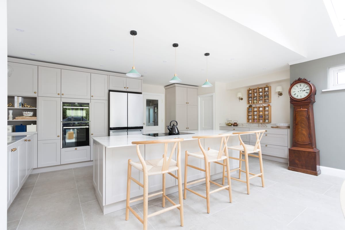
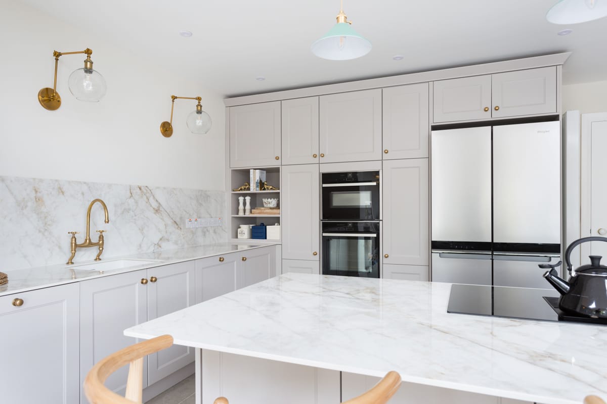
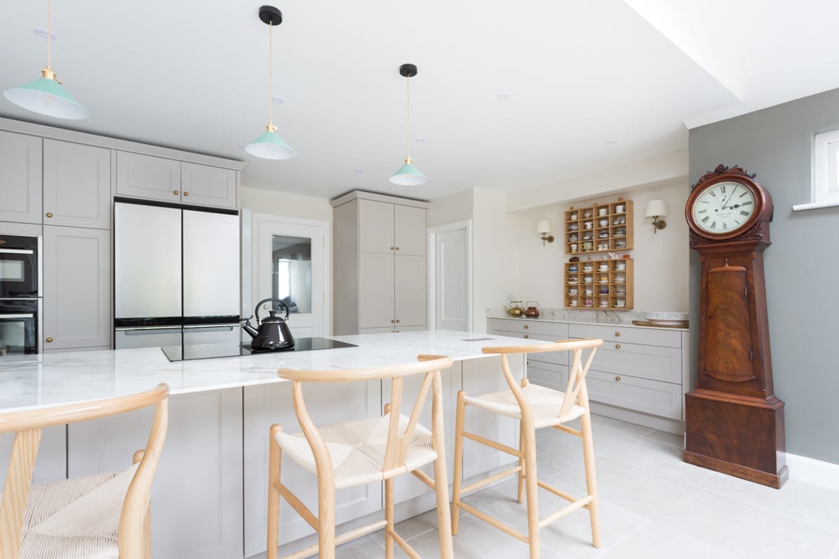
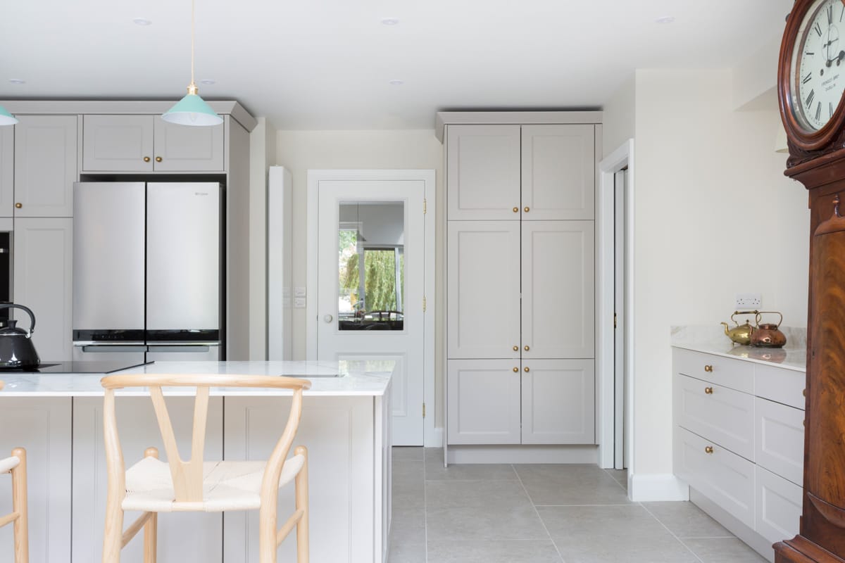
cabinetry. It was so high maintenance in terms of the cleaning that I knew when it came to this new kitchen that I wanted to go lighter. I love the taupe colour and it also adds to the bright, spacious feel of the whole room. Although, most importantly, I don’t see a single speck of dirt!’
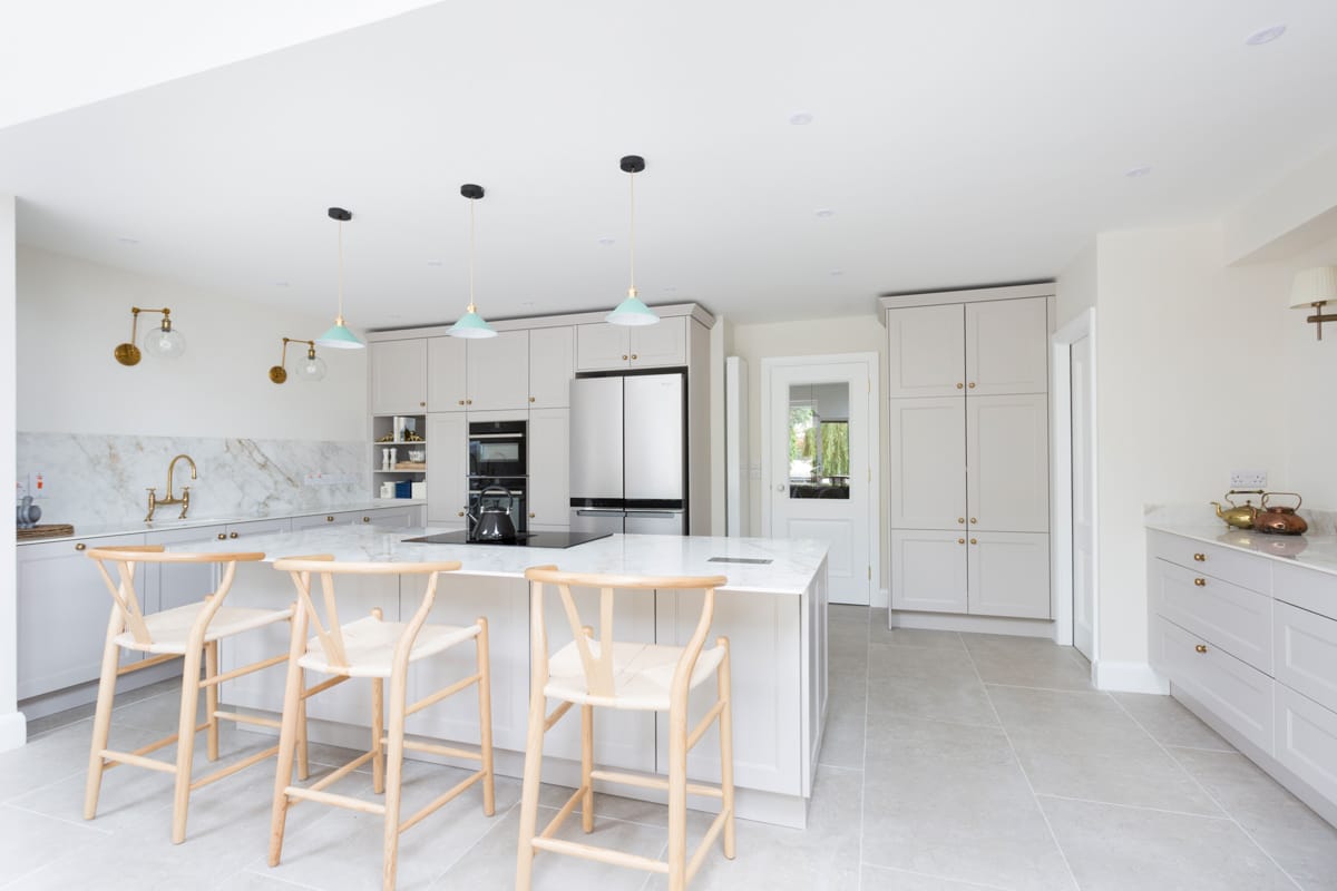
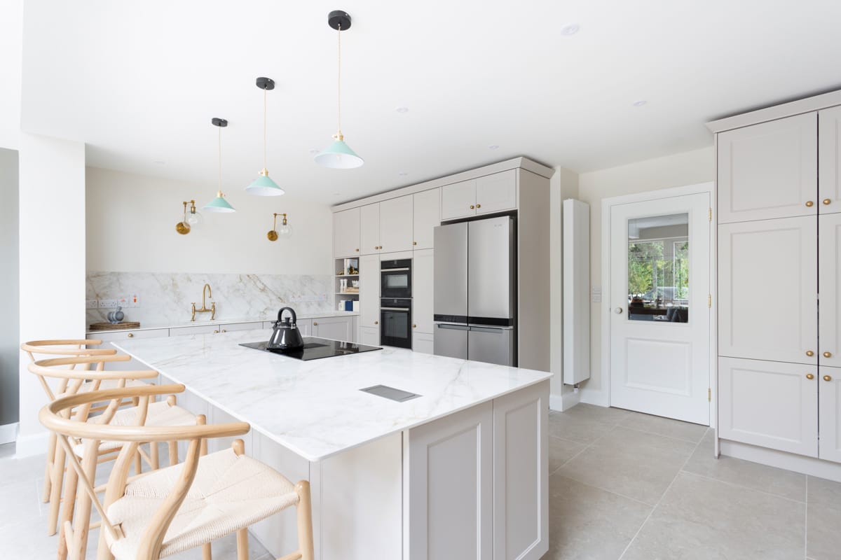
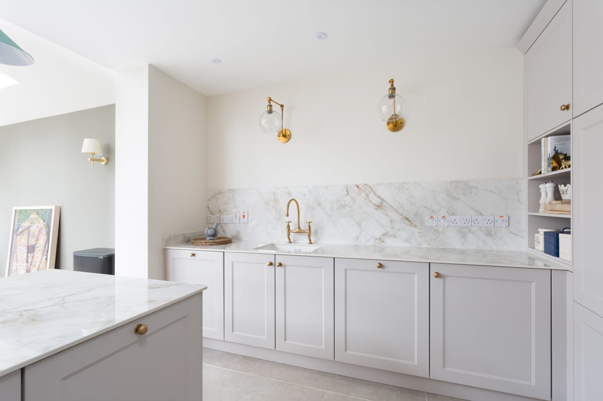
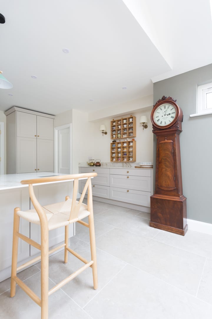
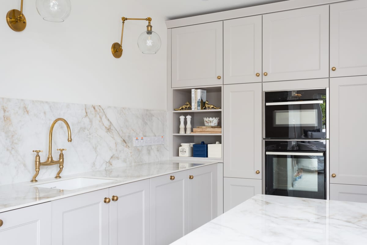
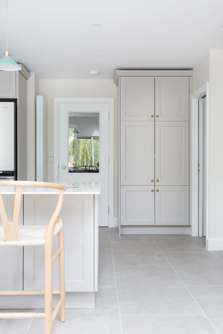
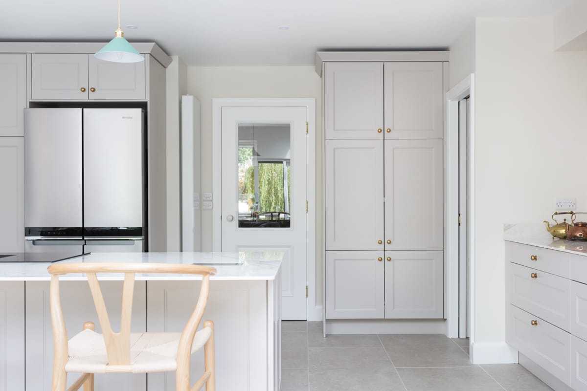
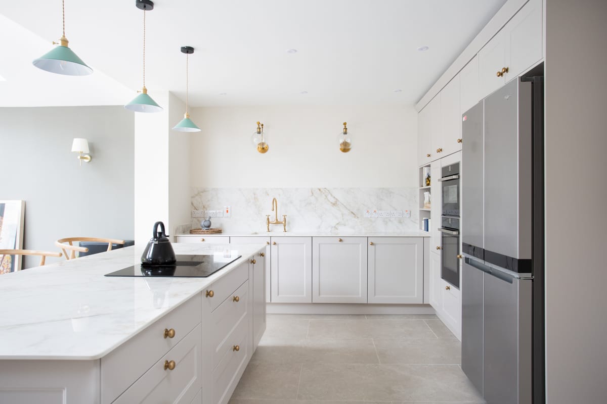
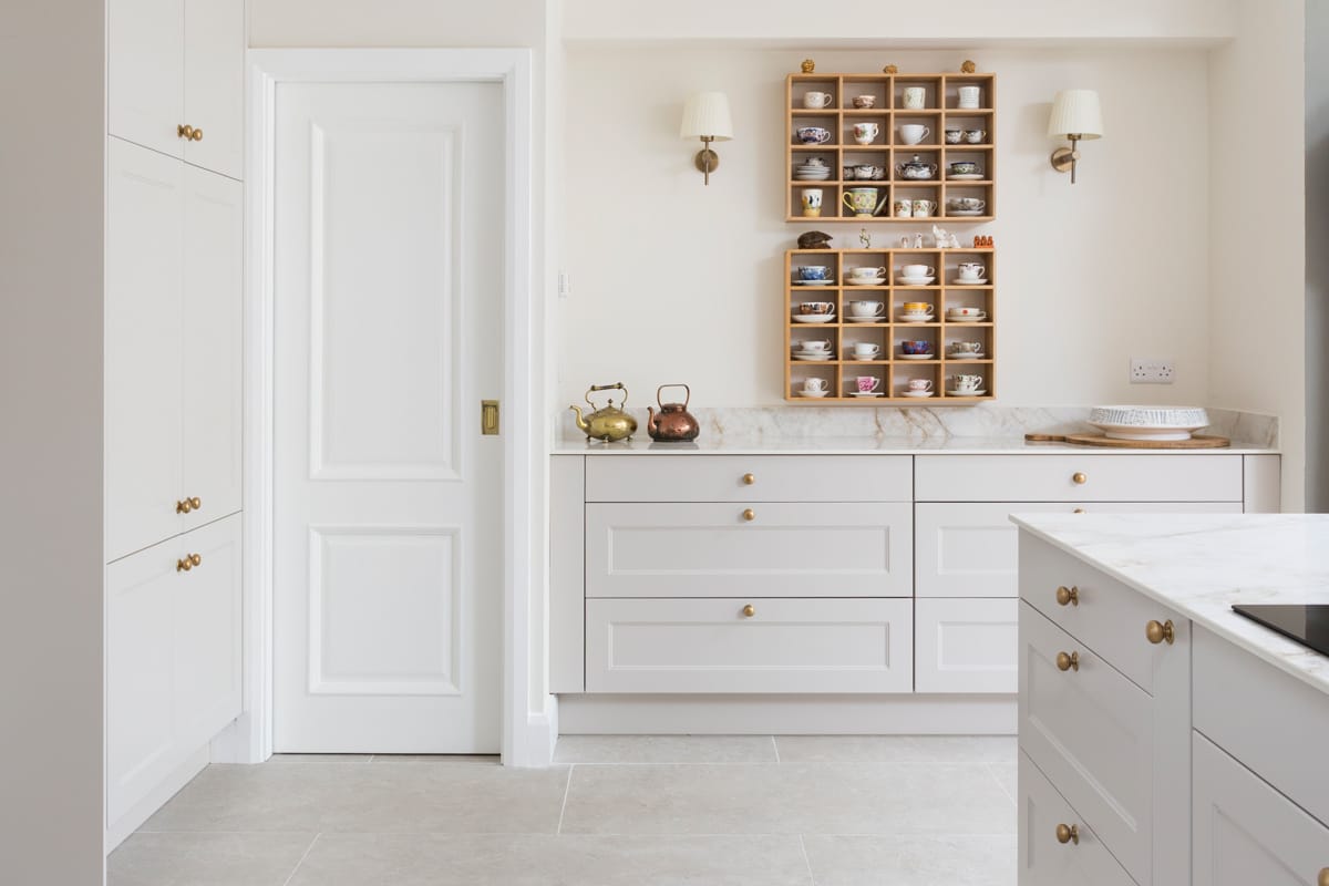
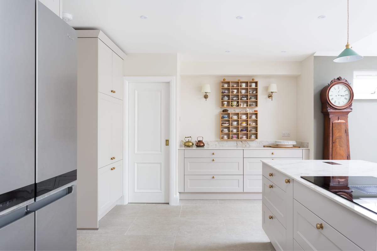
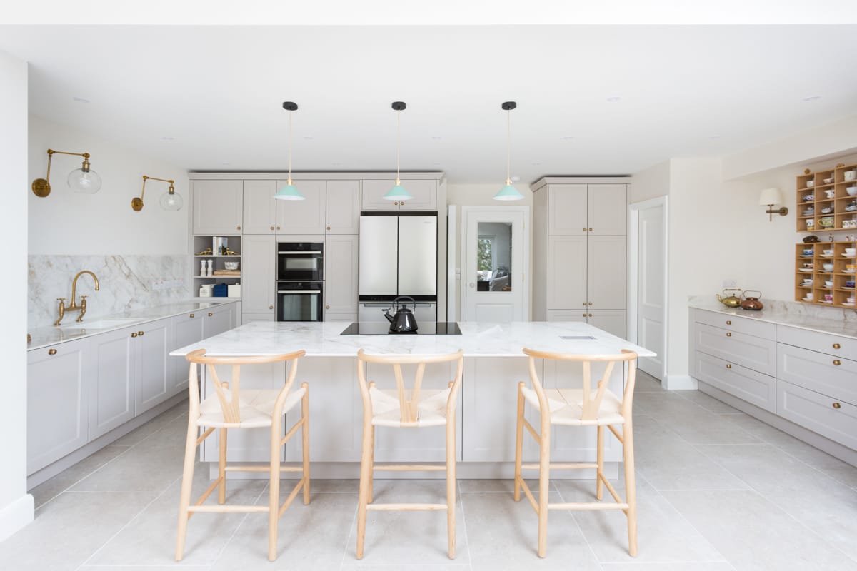
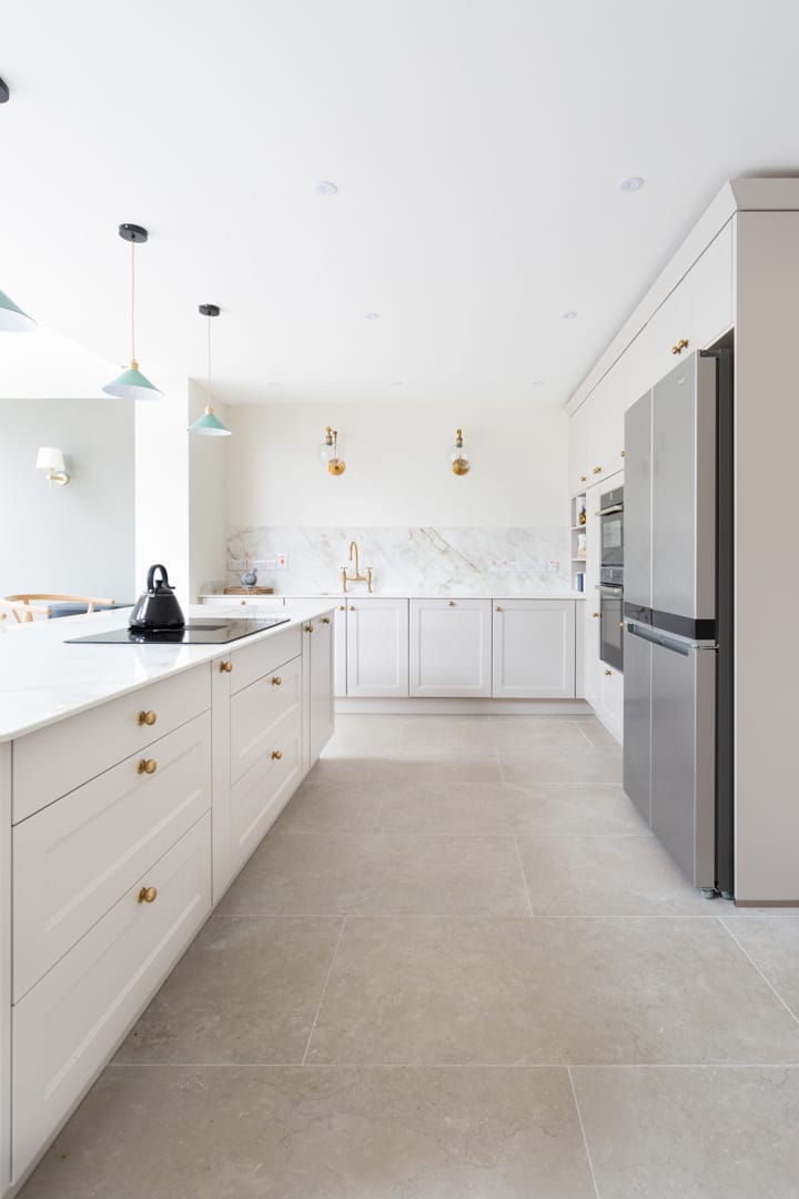
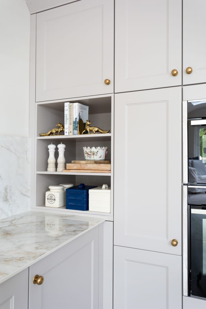
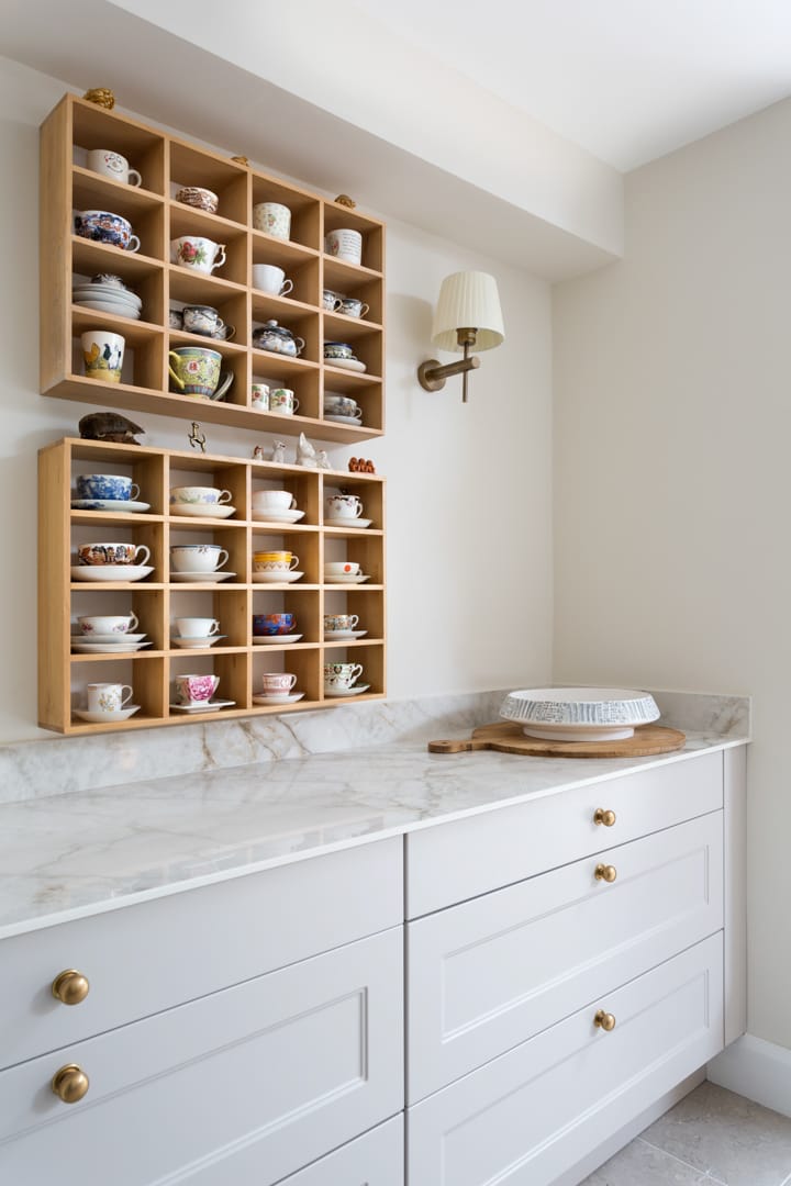
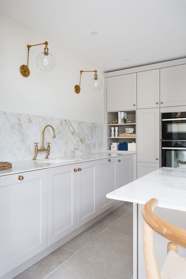
‘The ceramic worktop and the splashback with marble effect complement the shaker-style units. The bronze accents in the form of the handles and tap add to the sophisticated, elegant look of the whole design,’ adds Mariana.
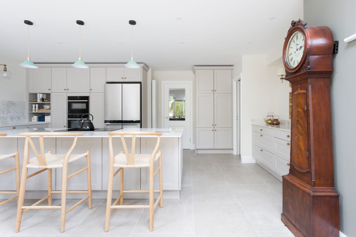
Within her kitchen, Jill has the luxury of space for a large three-metre island, which is also where she wanted her hob positioned. ‘I do have a preference for a hob in the island and when cooking and entertaining I find that you can interact better with others in the kitchen. I like to entertain, so it is important that my kitchen functions as a sociable space and the island is the perfect addition for friends and family to gather around while I cook,’ adds Jill.


