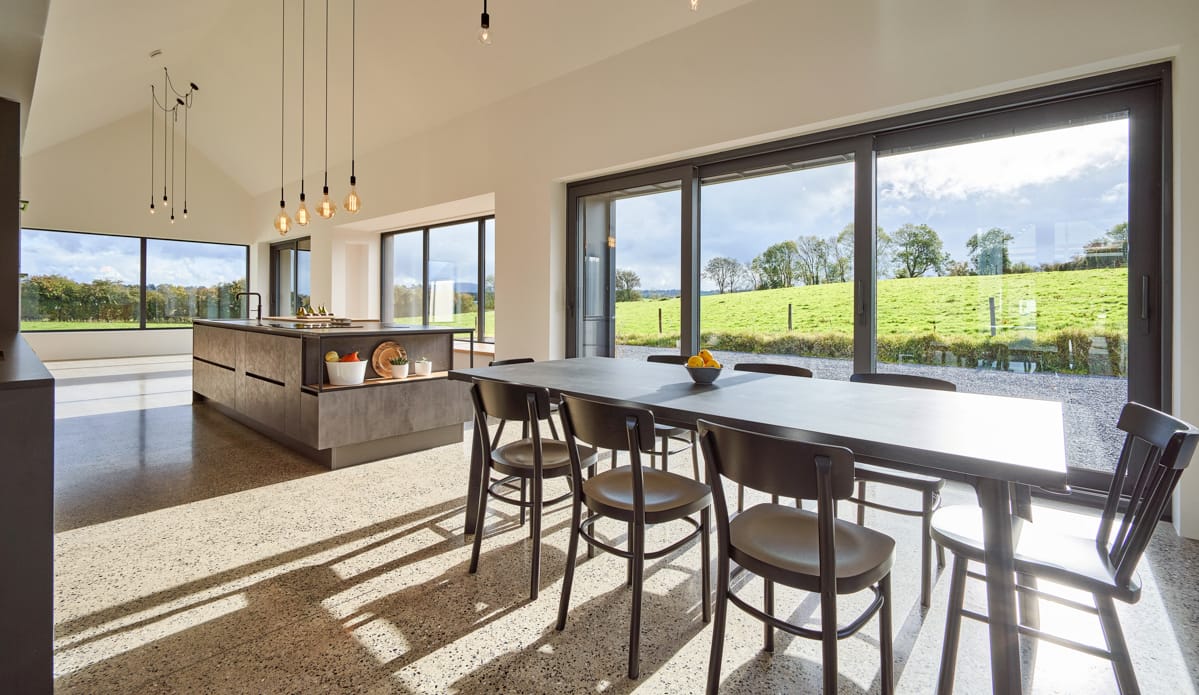
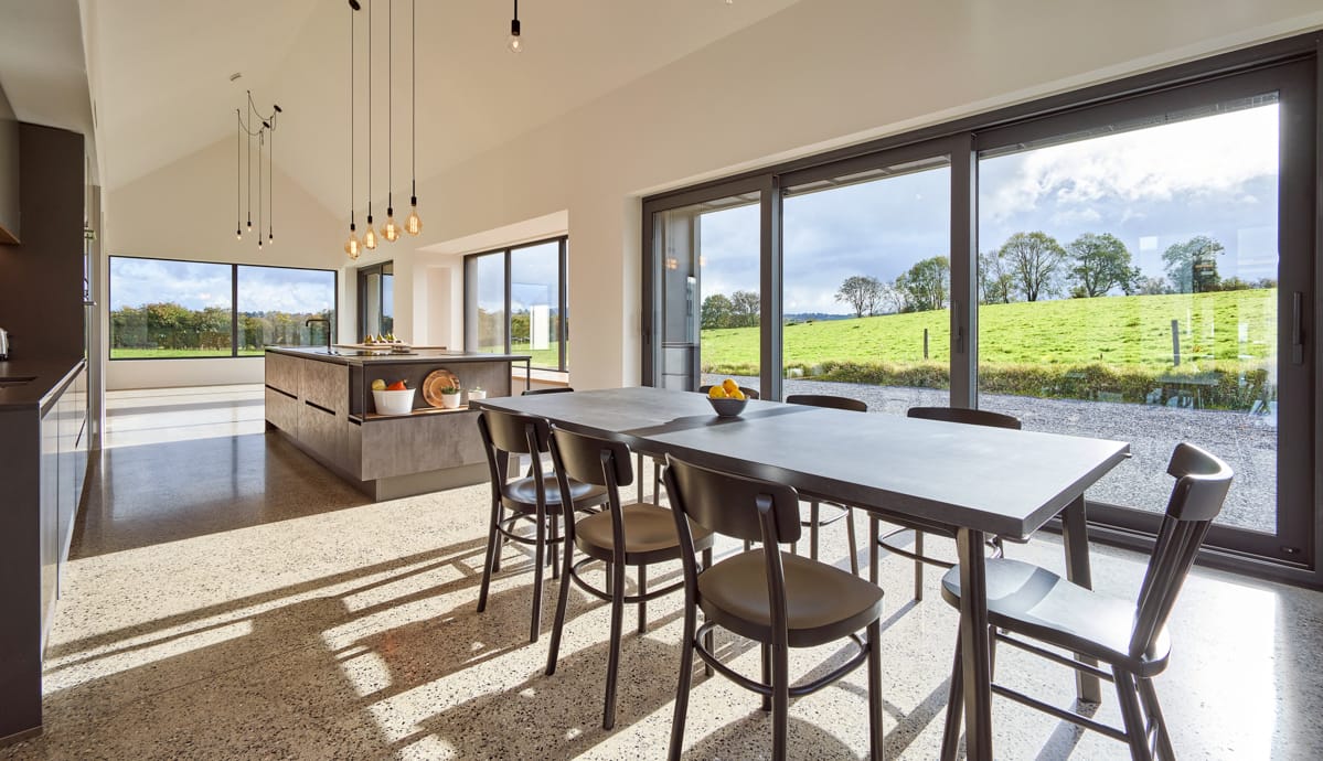
When it came to building her new home and subsequently designing the kitchen, architect and kitchen designer Áine opted for a timeless design that worked within the immediate space and blended with the design of the whole house.
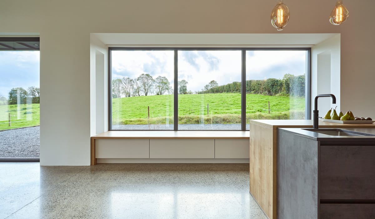
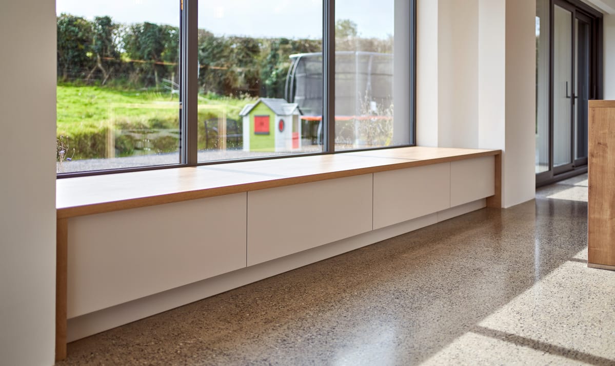
‘When I was designing the house and kitchen I didn’t have the experience of two young children and how they would use the space. My four-year-old daughter Ana-Rose has been using the window seat rather than the playroom to get some space to play with her toys away from my 18 month old son Mikey. However, he has just learnt how to pull himself up on them – so that’s fun making sure he doesn’t fall off!’
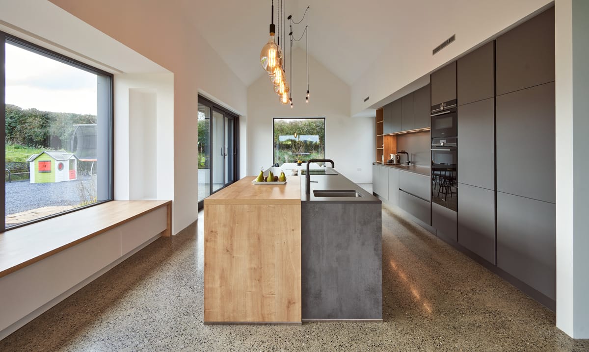
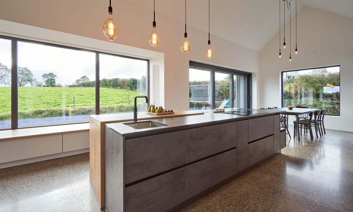
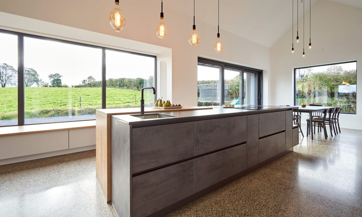
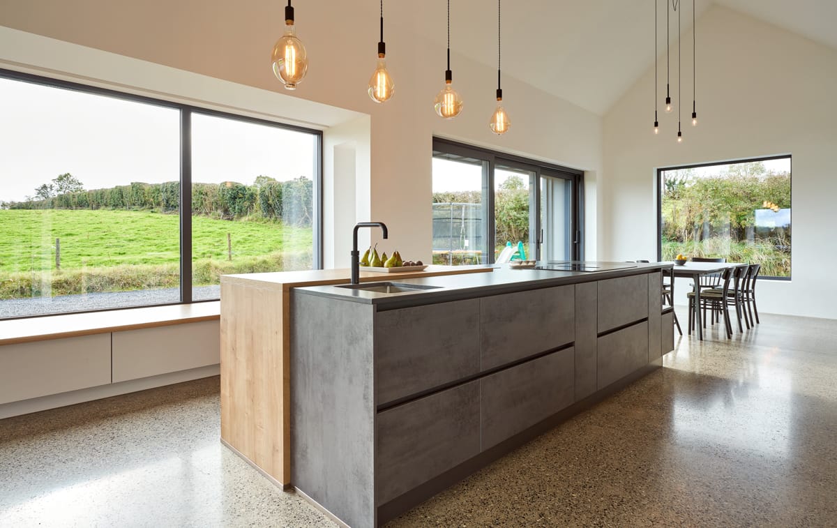
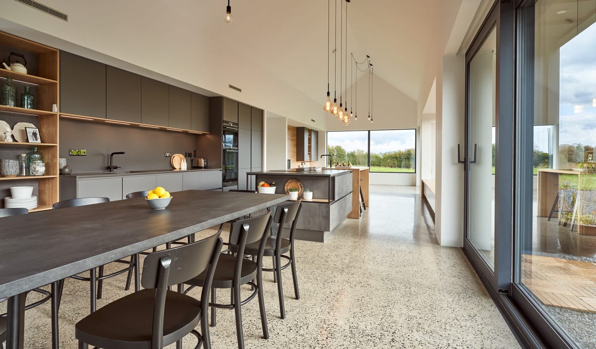
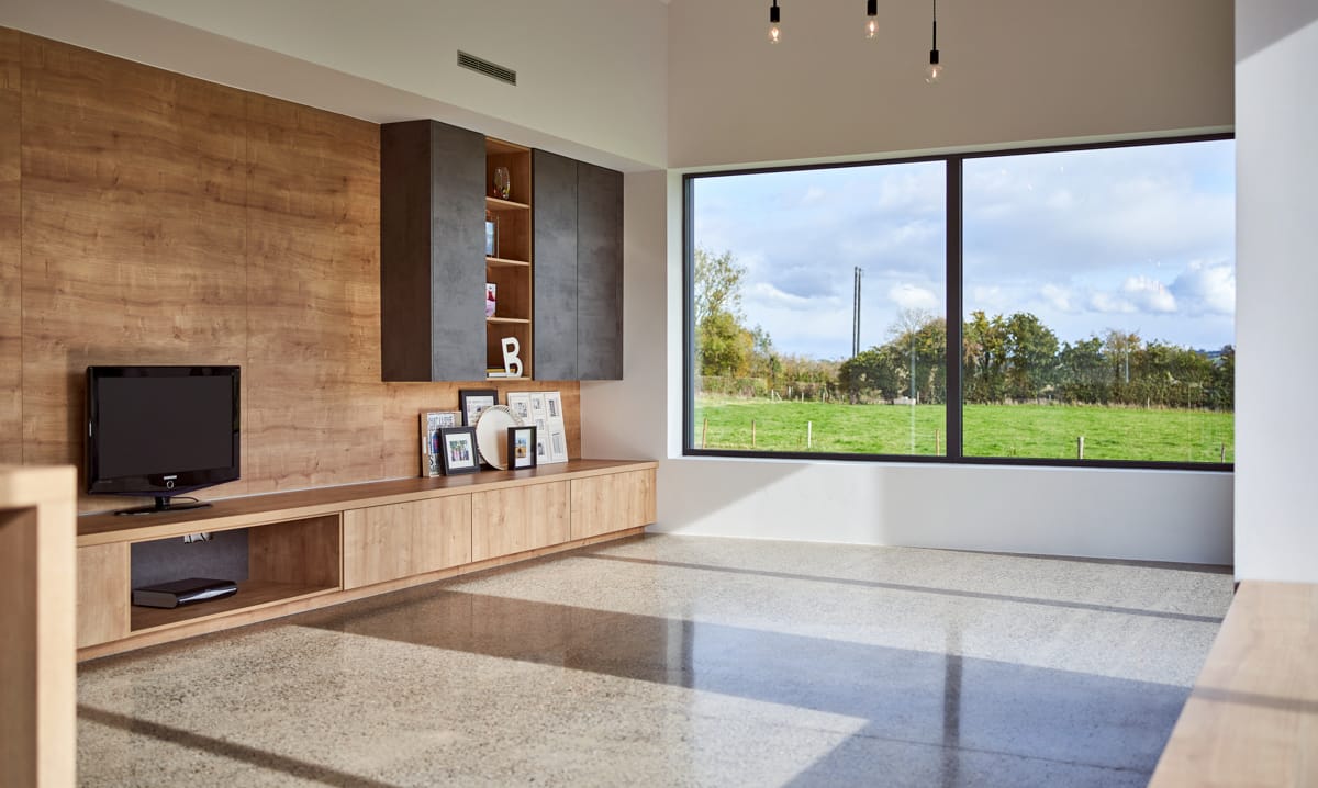
While Áine may have her hands full at the moment, the oak laminate window seat is definitely the perfect addition in this space which offers fantastics views out over the surrounding countryside, and it will certainly be somewhere the children will enjoy spending time playing with toys or reading a book as the years go by and they grow up in this space.
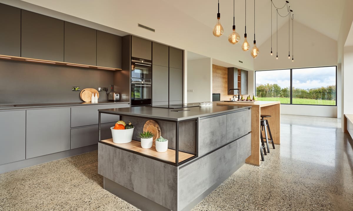
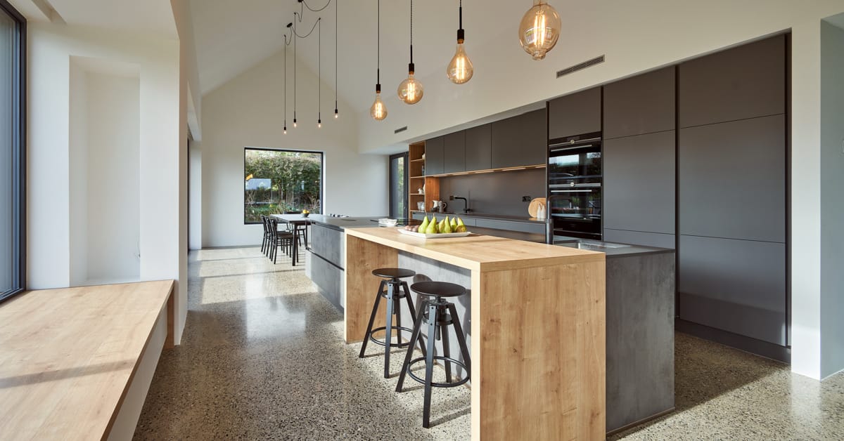
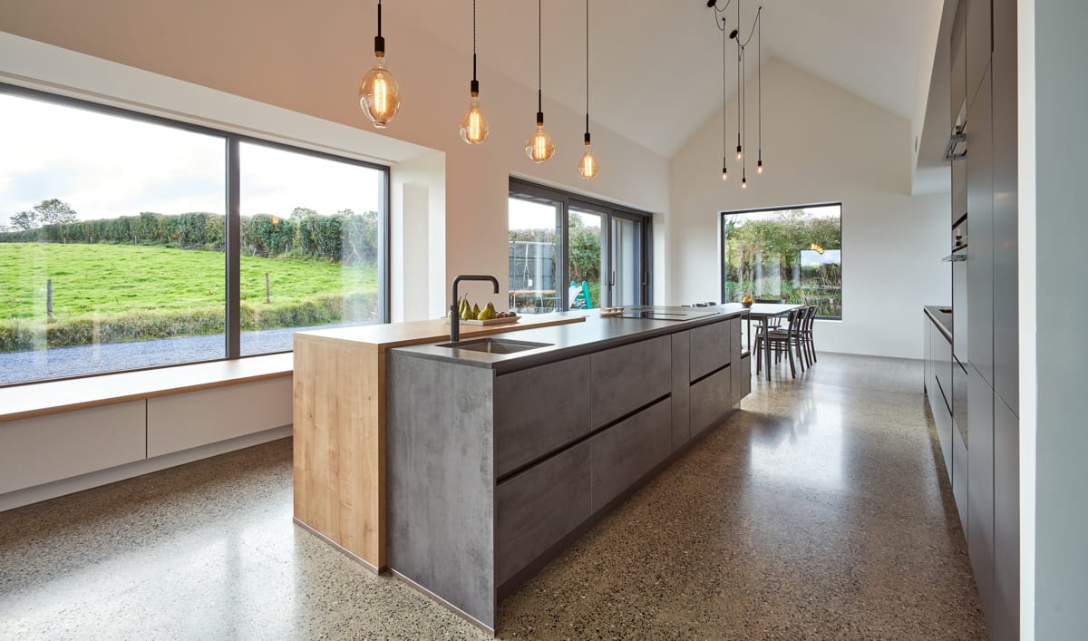
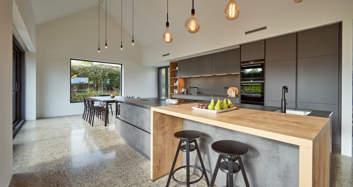
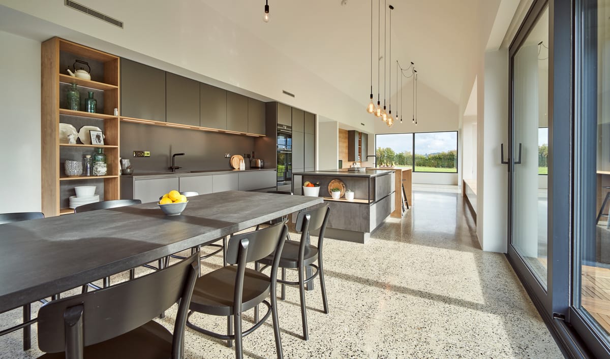
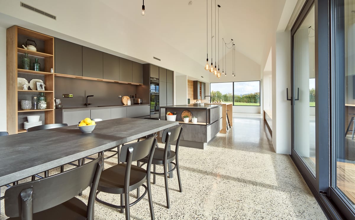
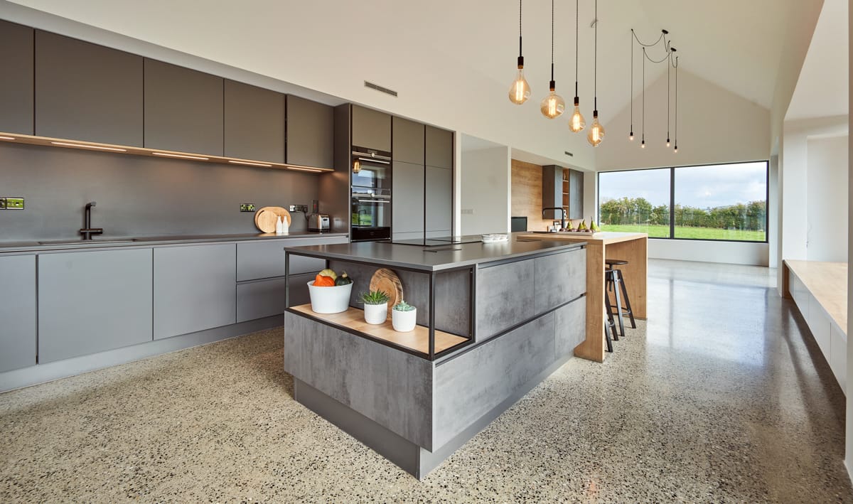
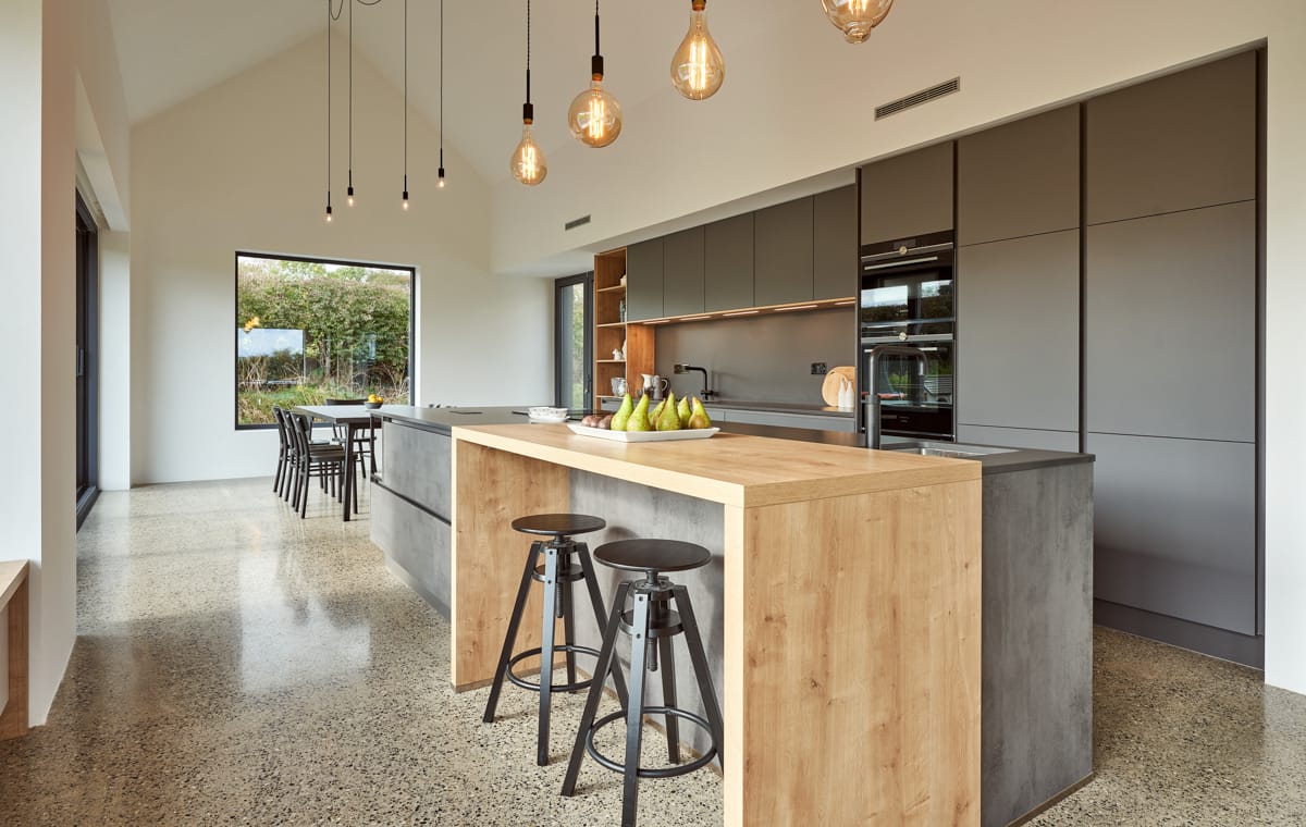
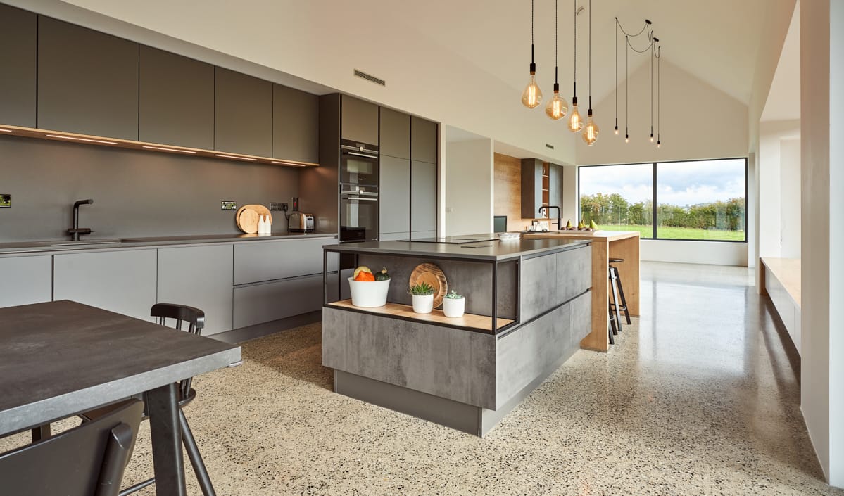
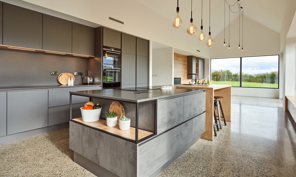
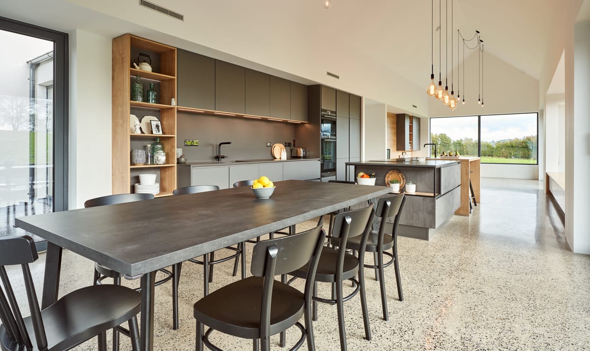
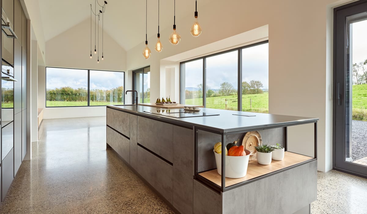
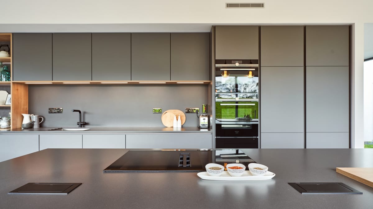
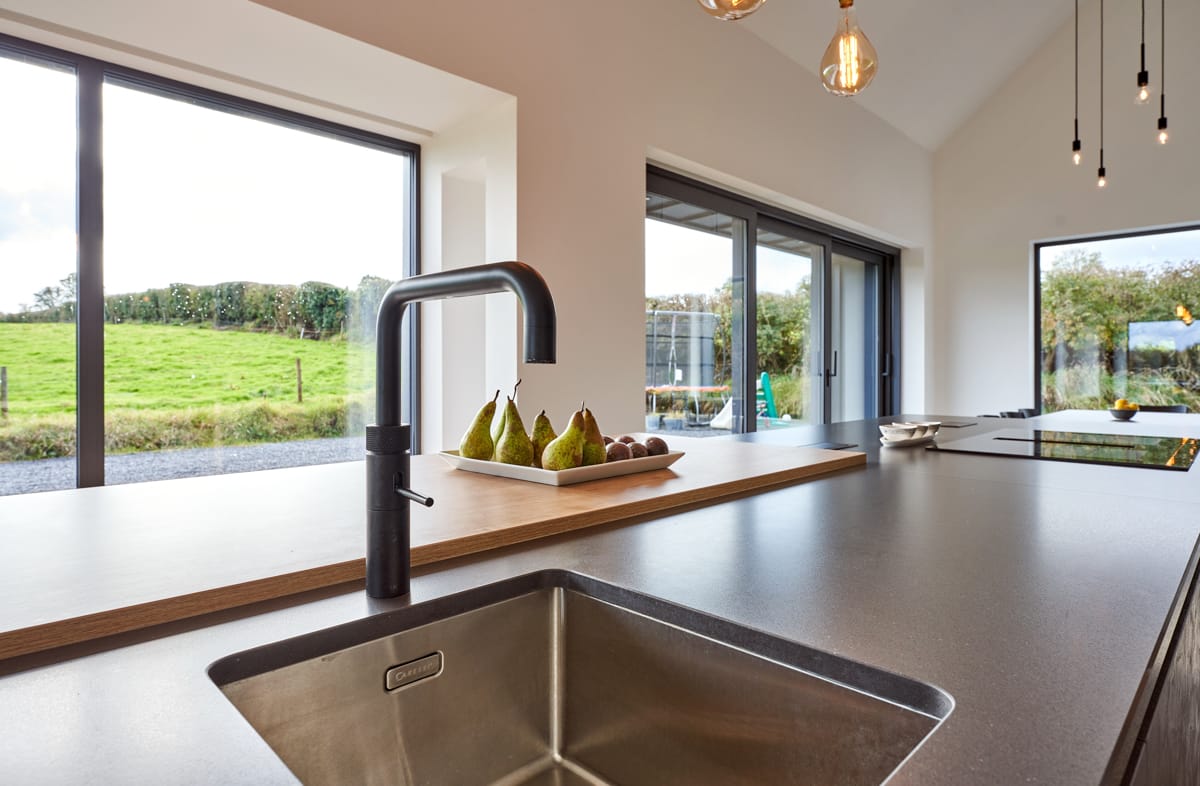
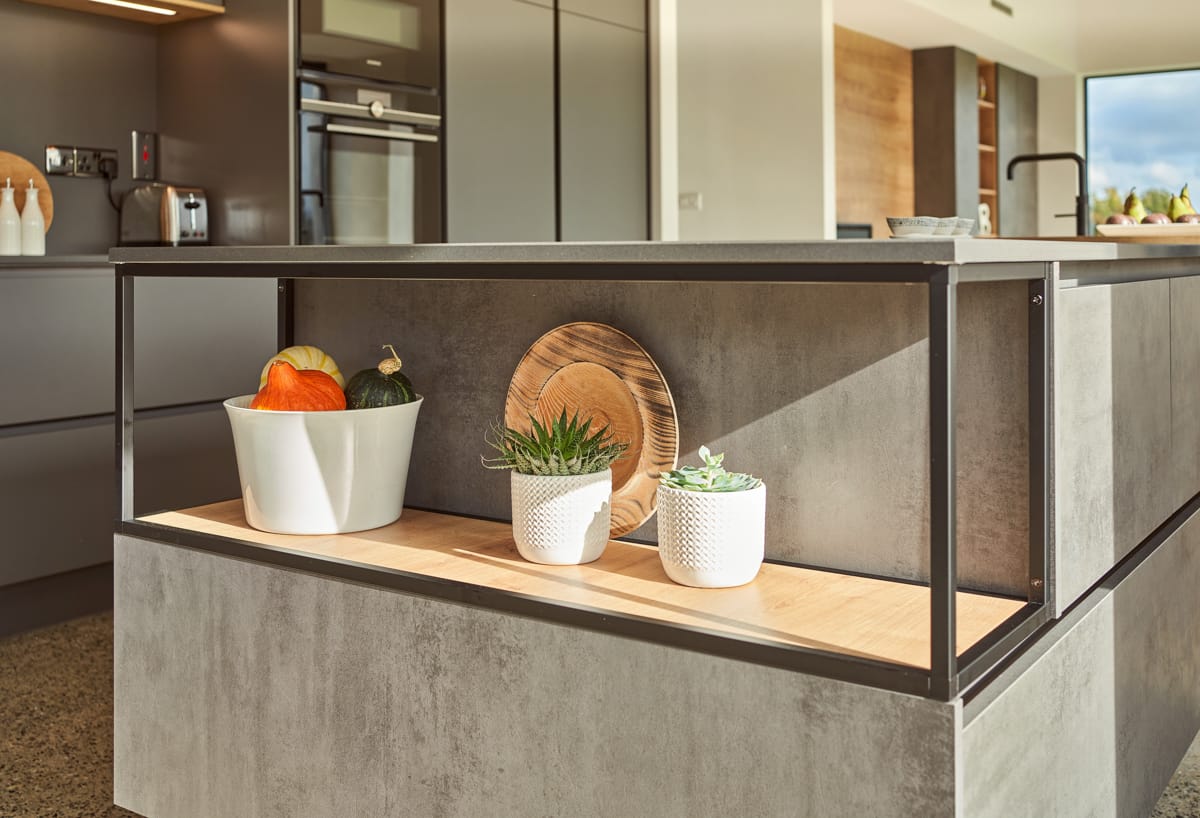
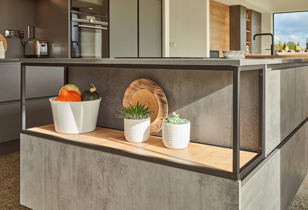
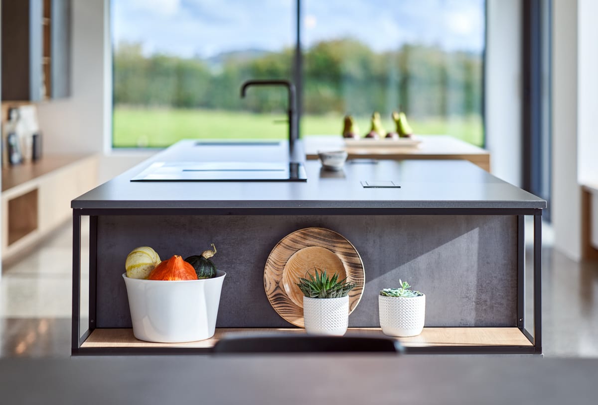
Áine decided on a grey colour scheme and softened this with oak accents, which can be seen on the island with the breakfast bar and open shelves, a detail which is also picked up on the bank of units. ‘Again the open shelving on the island isn’t toddler friendly,’ laughs Áine, ‘but I wanted a ‘living kitchen’ design that blends well with the adjoining dining and living spaces. I have also used this open oak shelving on the bank of units, which are backlit, creating a lovely ambience within the wider space as well.’
Like most homeowners today, Áine and Michael wanted a kitchen design that worked well for them as a family of four, but also when extended family are round. As Áine explains, ‘Both Michael and I have large families and this year when we celebrated Mikey’s first birthday in February, just before lockdown, we were able to have them all here to celebrate, so we know the space works well for entertaining, even if it might be a while before we get the chance to host everyone together in this space again.’
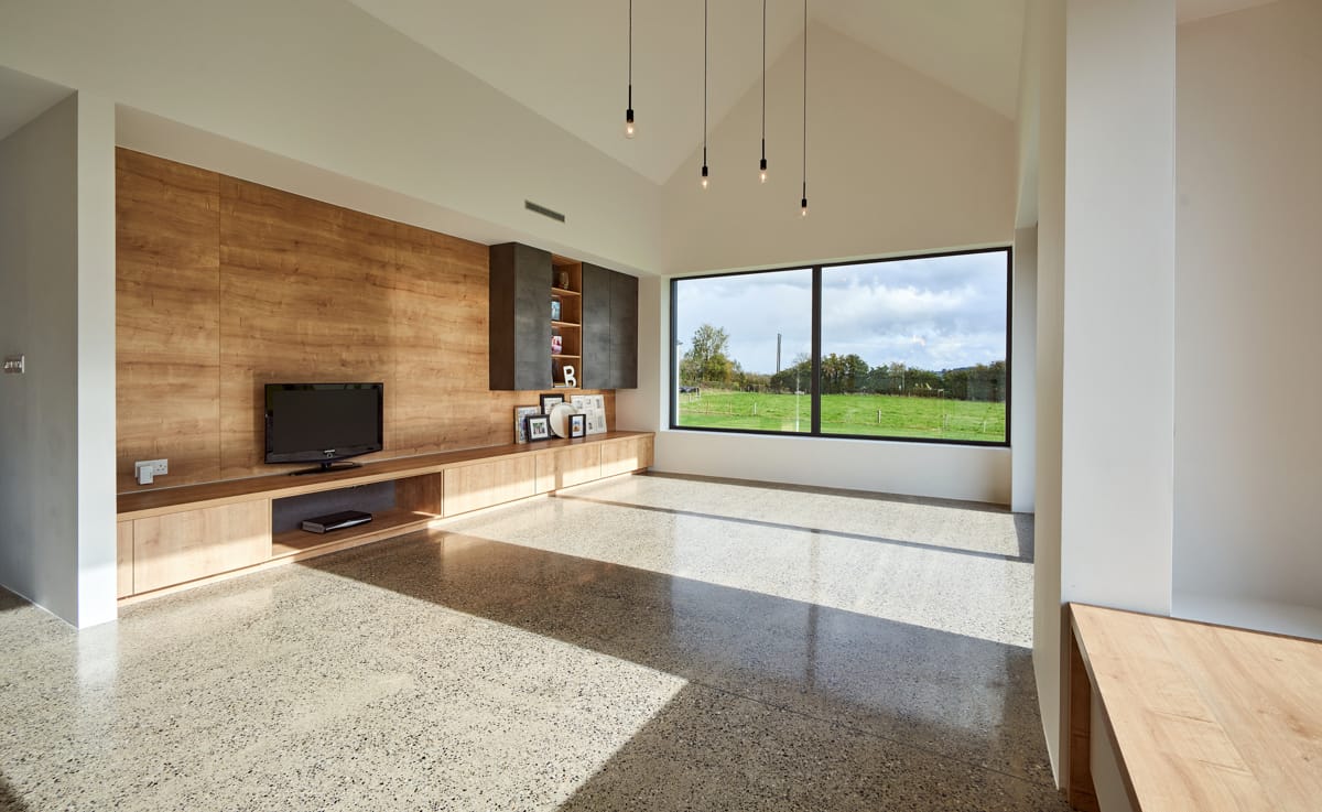
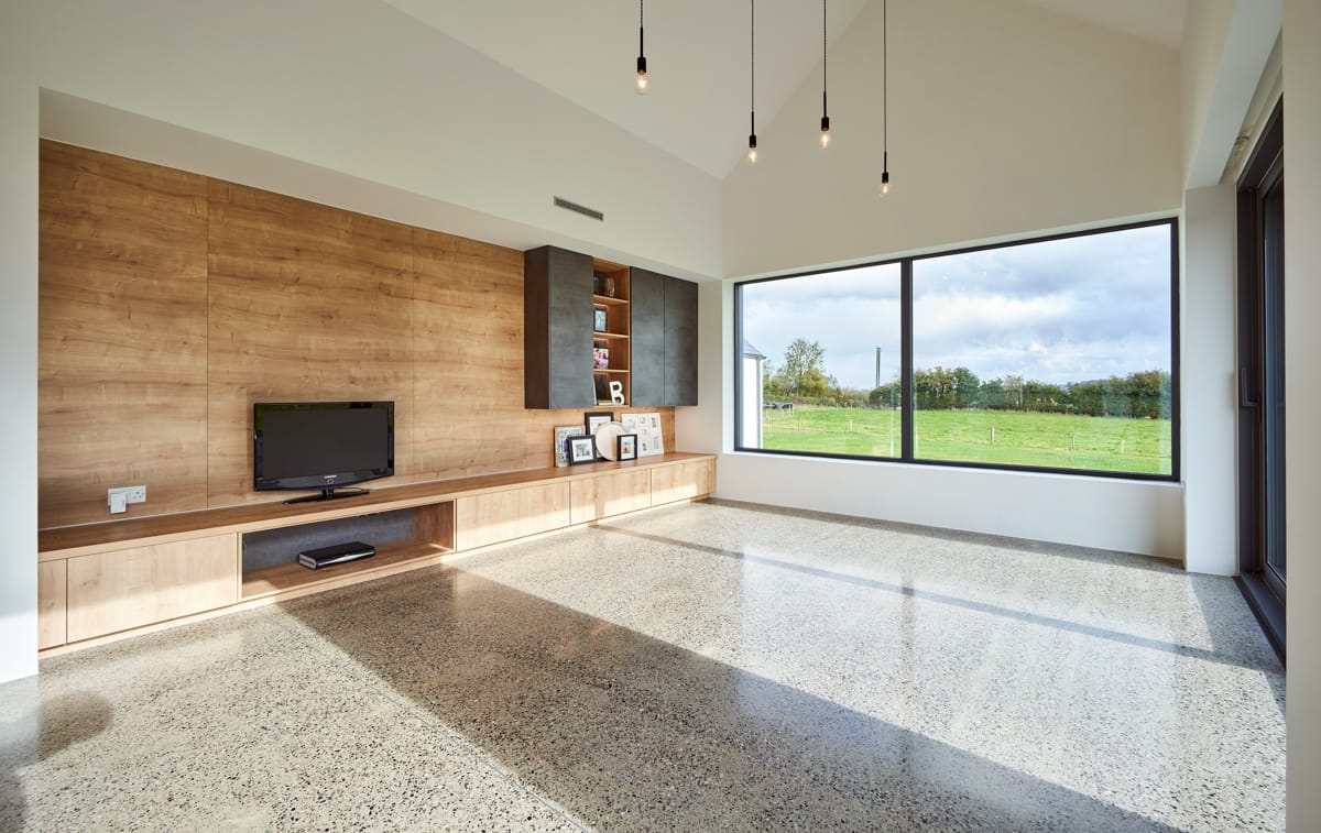
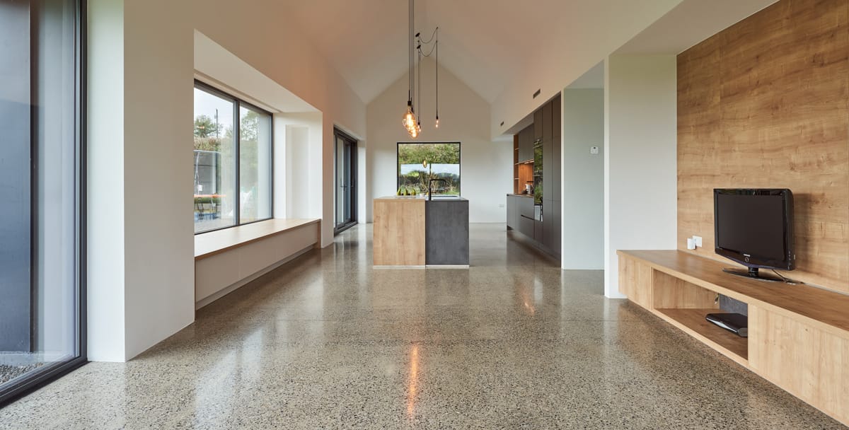
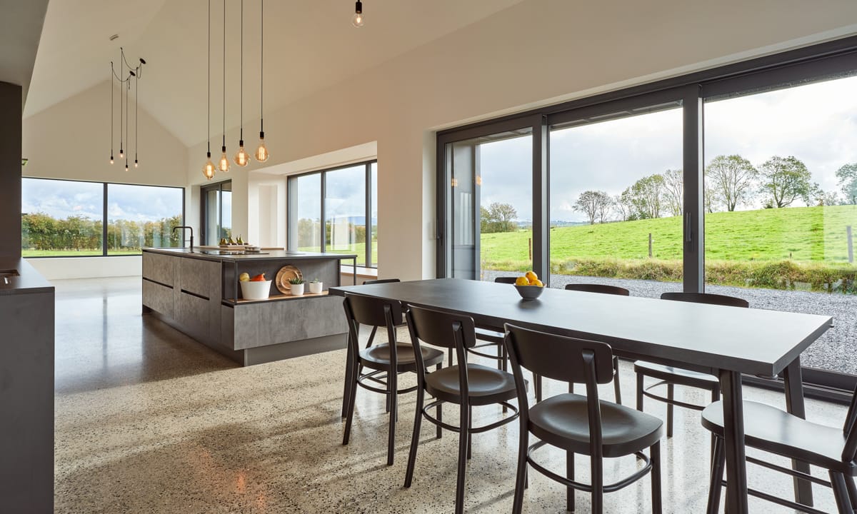
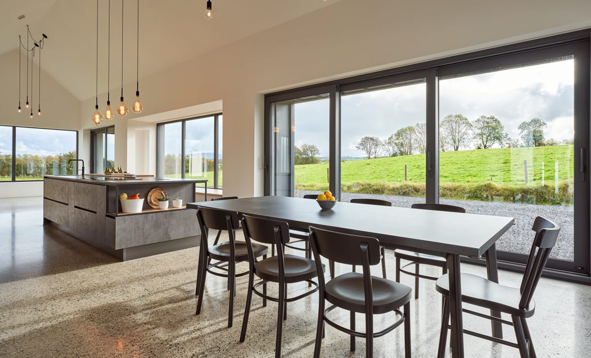
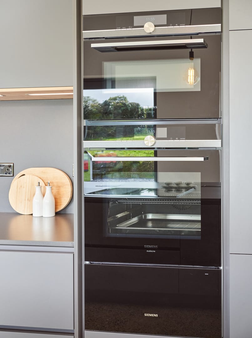
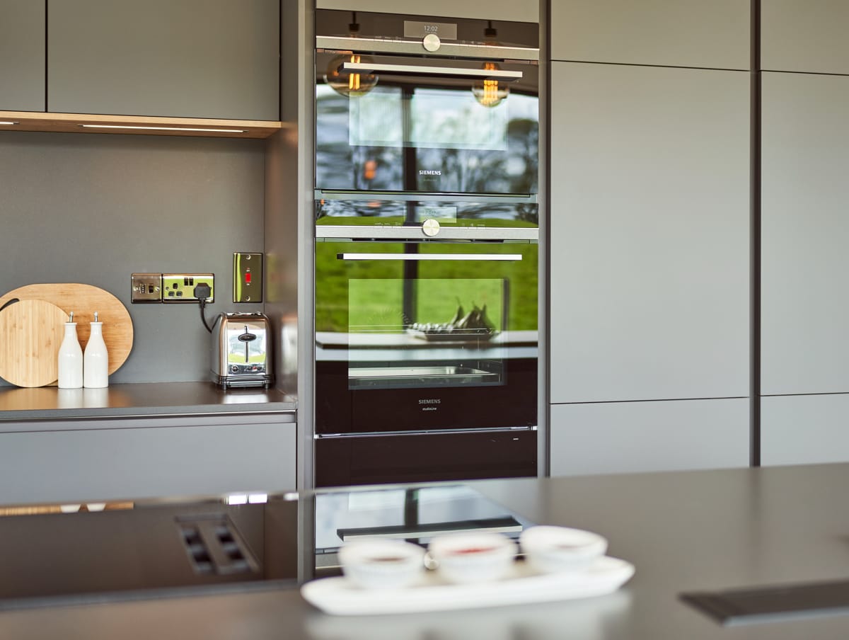
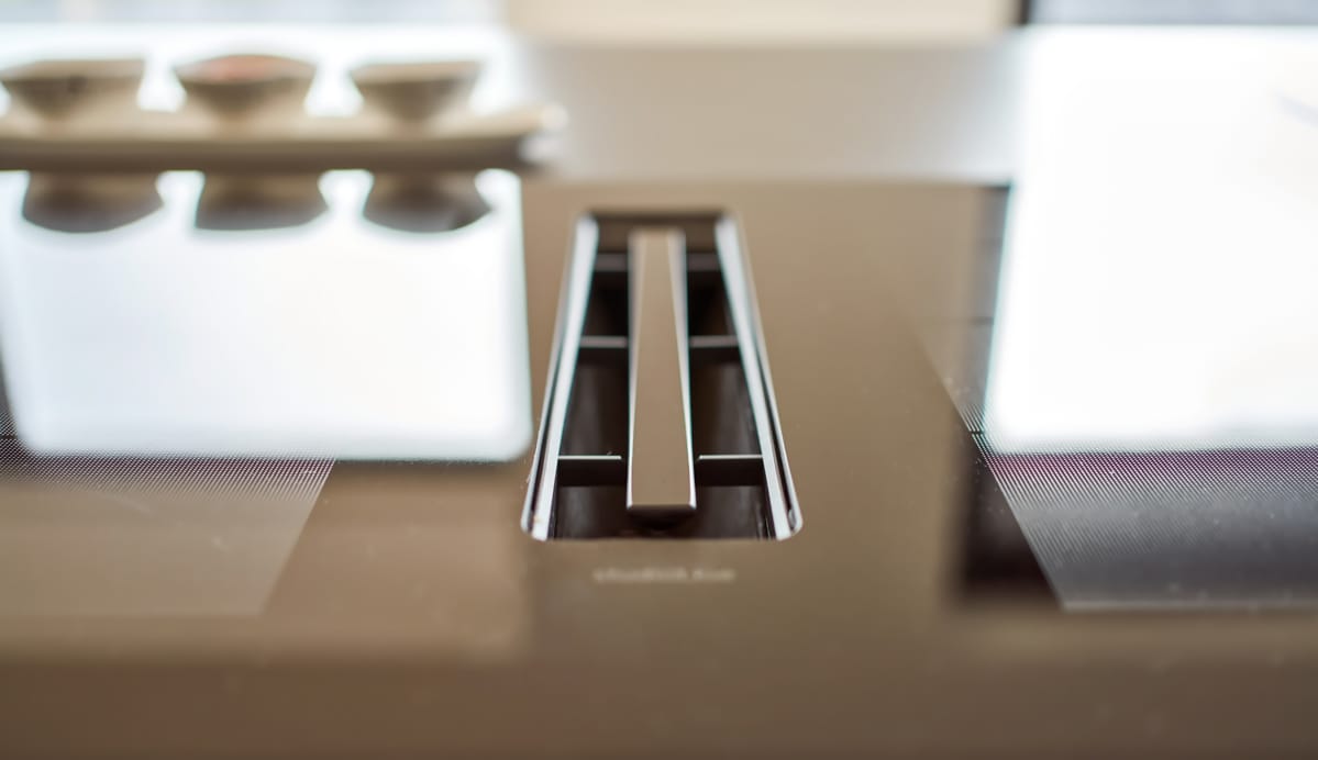
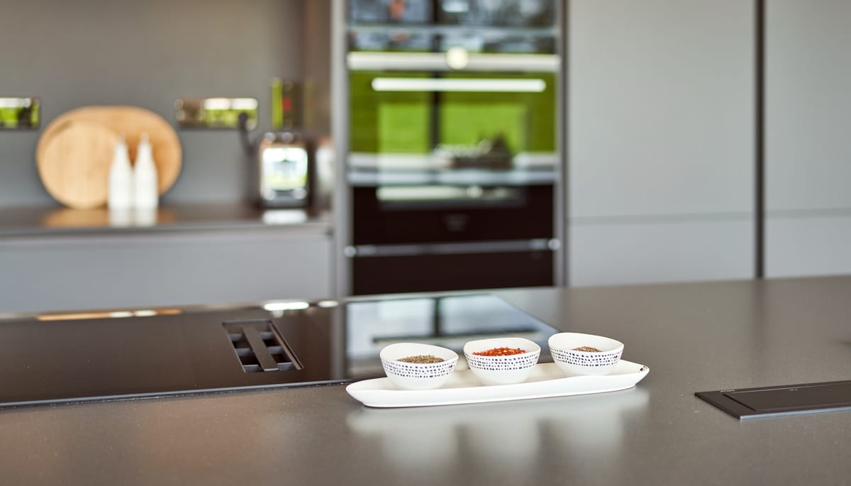
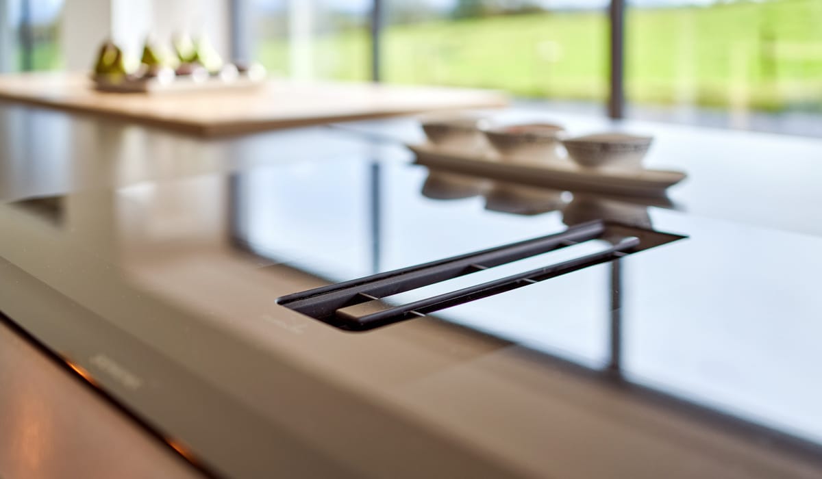
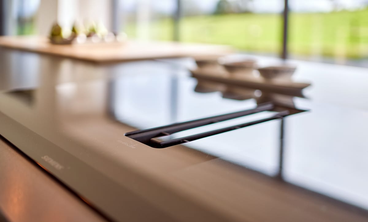
‘I decided on a contemporary handleless kitchen design from Timbercraft, who also built the window seat, entertainment unit in the adjoining open-plan living space and the dining table. I have combined two different finishes on the cabinetry. The appliance wall is finished in a matt grey, but on the island I have opted for a subtle contrast with a grey textured door. I kept all of the worktops the same and they are Silestone 20mm honed marengo quartz, which is a deep grey colour to seamlessly blend with the cabinetry. As for the flooring, I went with a polished concrete which runs throughout the entire open-plan space. The bank of units running along the wall houses the oven, combo microwave and warming drawing, as well as a large food pantry and larder fridge. All of the appliances in the kitchen are by Siemens, and the induction hob on the island, one of their newest models, includes a downdraft extractor.‘
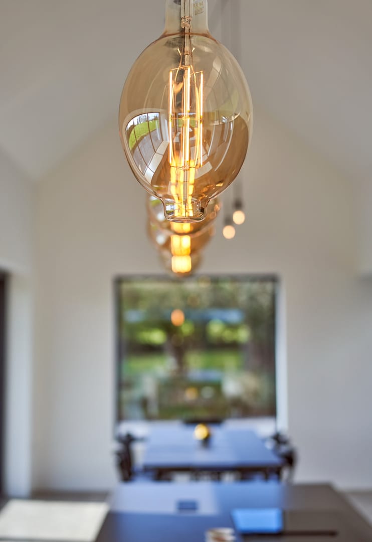
‘I knew I wanted to have pendant lighting with the exposed Edison lightbulbs above the island, but also the height of the ceiling meant that a downdraft extractor was the best option,’ explains Áine. ‘The house is airtight so I have recirculation downdraft,’ she adds.
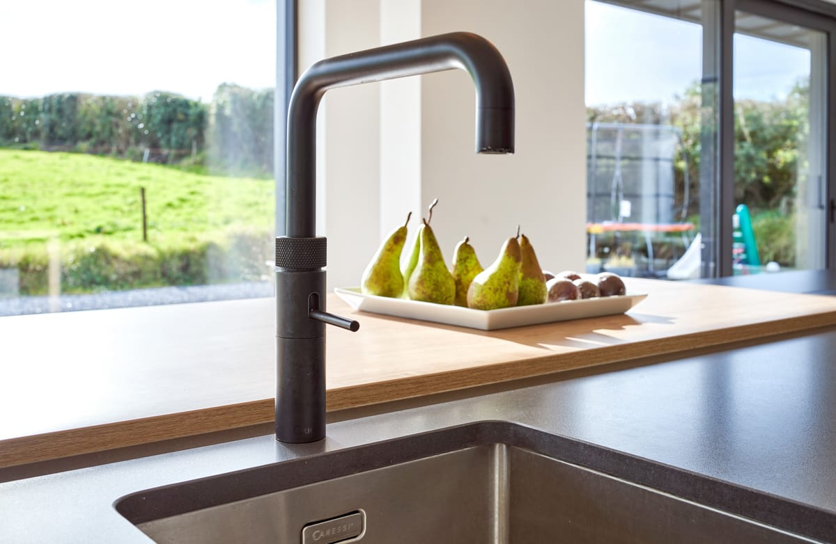
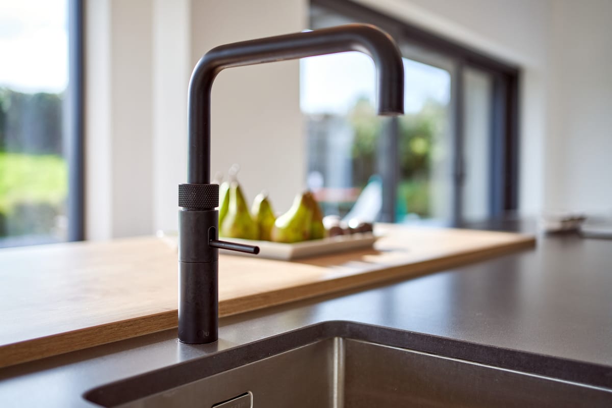
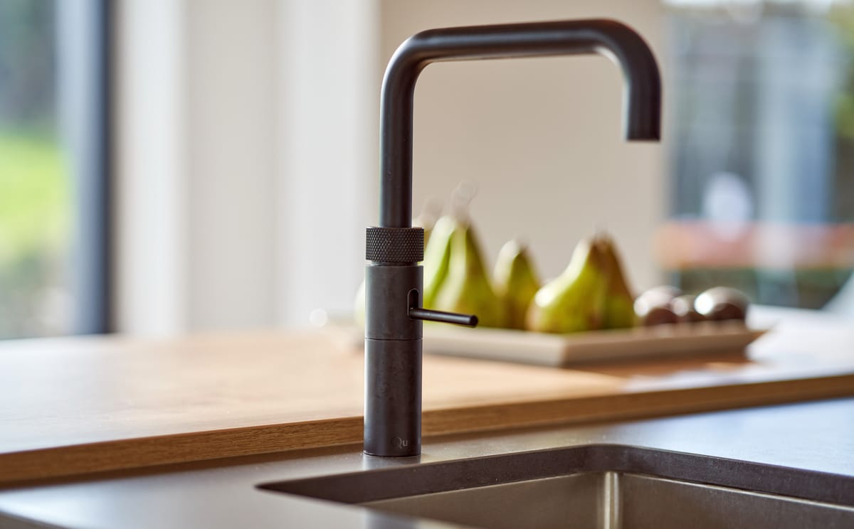
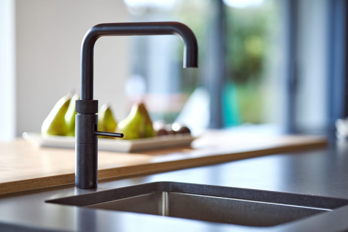
Also positioned on this impressive island is a prep sink paired with a Quooker tap, that not only provides boiling water, but also chilled, filtered and sparkling water as well.
‘Having this second prep sink in the kitchen makes cooking so much easier and it’s great for making tea and coffee at the breakfast bar. The sink used for washing and rinsing dishes is in the bank of units and just to hand underneath here is all of our recycling bins.’
‘Knowing all of the many options available I have to say designing my own kitchen was definitely more challenging than I thought it would be,’ comments Áine, ‘however, I have to say that I’m delighted with the finished look and function of it within the wider space.’


